![]()
Corporate colours are significant and prominent elements within the brand signature system.
Therefore, proper use of corporate colours is crucial to the integrity of the brand
expression.
Primary colours
Axiata Blue and Axiata Red are Axiata’s primary colours. They should be the colours used
most prominently with at least 50% usage in all communications.
Prism colours
Apart from the Axiata Red, Axiata Gold, Axiata Orange, Axiata Red Orange, Axiata Purple and
Axiata Magenta make up the Axiata’s prism colours. They can be used as the alternative
colours in communications though the primary colours usage is more advisable.
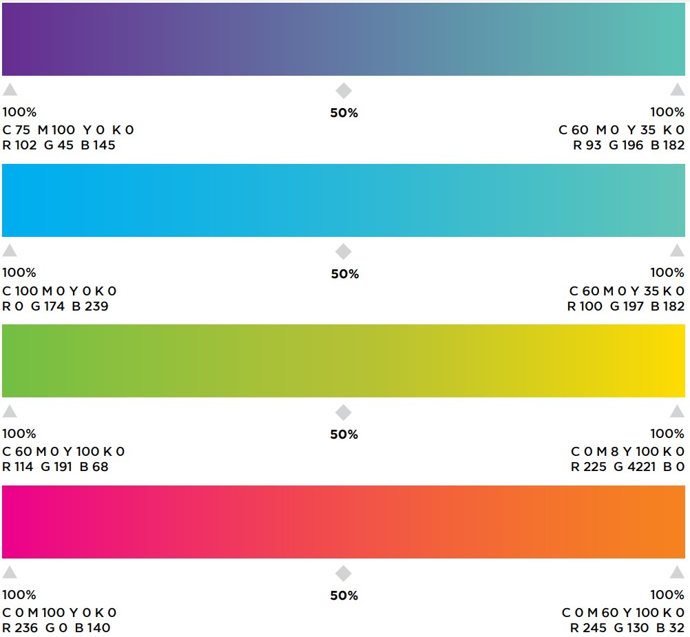
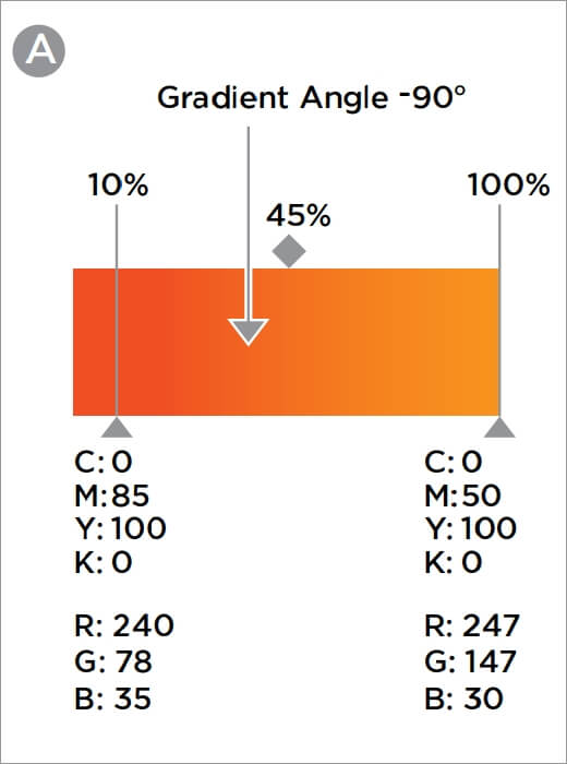
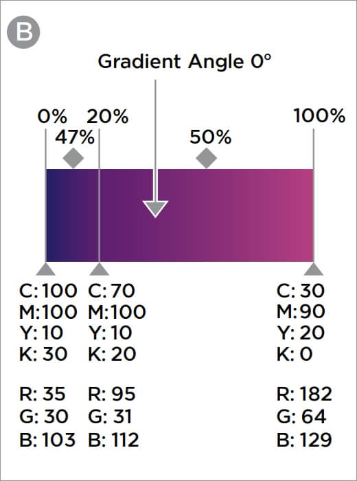
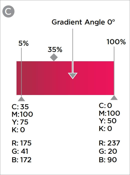
The secondary colour palette consists of a light colour range and gradient colour range.
They can be used as the alternative colours in communications, though the use of the primary
colours and prism colours is preferred.
The secondary colour palette consists of a light colour range and gradient colour range.
They can be used as the alternative colours in communications, though the use of the primary
colours and prism colours is preferred.
The corporate colours have been specially chosen to differentiate Axiata as unique and
contemporary.
The reproduction of these colours must visually match the colour in this section.
The diagram on this page shows how the corporate colours are used on the brand signature.

The corporate colours have been specially chosen to differentiate Axiata as unique and
contemporary.
The reproduction of these colours must visually match the colour in this section.
The diagram on this page shows how the corporate colours are used on the brand signature.

PANTONE
280CPANTONE
7406CPANTONE
130CPANTONE
158CPANTONE
2425CPANTONE
207CPANTONE
205C


 Avoid choosing images with busy and complicated environment
 Avoid using imagery through the reflection of glass or shine of
any sort. Nothing should distract the focus away from the chosen
images
Avoid using imagery through the reflection of glass or shine of
any sort. Nothing should distract the focus away from the chosen
images
 Images should never have motion blur as to not take away
from the focus of the visual
Images should never have motion blur as to not take away
from the focus of the visual
 Ideally the imagery should not show the back of the talent