01


COLOUR


Corporate Colours

Corporate Colour is a significant and prominent element within the brand signature system. Therefore, proper use of corporate colours is crucial to the integrity of the brand expression

Primary colours
Axiata Blue and Axiata Red are Axiata’s primary colours. They should be the colours used most prominently with at least 50% usage in all communications.

Prism colours
Apart from the Axiata Red, Axiata Gold, Axiata Orange, Axiata Red Orange, Axiata Purple and Axiata Magenta make up the Axiata’s prism colours. They can be used as the alternative colours in communications though the primary colours usage is more advisable.


Axiata Blue
Pantone 280C
C100 M80 Y0 K0
R22 G67 B150
Hex #164396
Axiata Red
Pantone 207C
C0 M100 Y60 K20
R196 G13 B66
Hex #C40D42
Axiata Gold
Pantone 7406C
C0 M30 Y90 K0
R253 G185 B52
Hex #FDB934
Axiata Orange
Pantone 130C
C0 M50 Y100 K0
R247 G148 B30
Hex #F7941E
Axiata Red Orange
Pantone 158C
C0 M80 Y100 K0
R241 G90 B34
Hex #F15A22
Axiata Purple
Pantone 2425C
C50 M100 Y20 K20
R123 G27 B103
Hex #7B1B67
Axiata Magenta
Pantone 205C
C0 M90 Y20 K0
R238 G62 B128
Hex #EE3E80


Secondary Colours

The secondary colour palette consists of a light colour range and gradient colour range. Both ranges apply to the prism fabric, but only the primary colour ranges applies to the brand signature.


Axiata Denim
Pantone 5405C
C65 M40 Y20 K0
R102 G137 B171
Hex #6689AB
Axiata Turquoise
Pantone 3125C
C70 M0 Y20 K0
R25 G190 B207
Hex #1DBECB
Axiata Green
Pantone 383C
C35 M0 Y100 K0
R179 G211 B53
Hex #B3D335
Axiata Peach
Pantone 178C
C0 M75 Y55 K0
R242 G102 B100
Hex #F26664
Axiata Silver
Pantone 537C
C10 M0 Y0 K20
R186 G202 B211
Hex #BACAD3
Axiata Grey
Pantone 445C
C15 M0 Y0 K65
R99 G113 B122
Hex #63717A


Corporate Colour Usage On Brand Signature

The corporate colours have been specially chosen to differentiate Axiata as unique and contemporary. The reproduction of these colours must visually match the colour in this section.

The diagram on this page shows how the corporate colours are used on the brand signature.
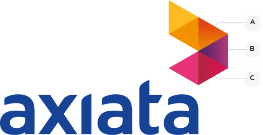


Corporate Brand Signature in Pantone

The corporate colours have been specially chosen to differentiate Axiata as unique and contemporary. The reproduction of these colours must visually match the colour in this section.

The diagram on this page shows how the corporate colours are used on the brand signature.



PANTONE

280C

PANTONE

7406C

PANTONE

130C

PANTONE

158C

PANTONE

2425C

PANTONE

207C

PANTONE

205C
02


TYPOGRAPHY


Axiata Typeface

Typography is an important part of our brand. The consistent use of our typeface allows audiences to quickly recognise materials from Axiata.

We have created a special typeface only available to Axiata and its operating companies.

The Axiata typeface is the primary English typeface and should be used whenever possible, in every communication.


To use the Axiata brand kit, kindly email us at [email protected]. Please state your name, organisation and the reason you are requesting access


Alternative Typeface for Special Situations

Arial is an acceptable substitute in situations where the Axiata typeface can not be used because of technical issues, as on web site and staff badges.


03


PHOTOGRAPHY


Photography Style

The Axiata brand uses photography to build upon a theme or to communicate an idea. The image style is exclusively meant to feature people and/or product shot on a fresh, vibrant and simple background. Please try to avoid choosing images with busy and complicated environment.

Based on the intended messaging, we can depict the photography scenarios in different ways:


Warmth

The photography chosen should bring out the warmth and/or human interaction

Connectivity

Images should showcase the positive impact of connectivity towards people

Innovation & Technology

To depict the interaction between our subject and the technology featured

Realistic

It must depict scenarios that are real to life, rather than staged or posed


Diversity

With our regional footprint, we can portray the diversity and richness of lives impacted by our presence


Application of Photography Style

In order to ensure that the brand does not deviate from its standard, specified visual attitude, set out here are a few things to avoid while selecting images for communication.

When showcasing talents, they should look as natural as possible. Avoid using images that feel too “posy”, are overly corporate/formal, or which have an overly futuristic treatment. Talents chosen should reflect the diversity found across Axiata’s OpCos.


Avoid choosing images with busy and complicated environment.

Avoid using imaginary through the reflection of glass or shine of any sort. Nothing should distract the focus away from the chosen images.

Images should never have motion blur as to not take away from the focus of the visual

Ideally the imagery should not show the back of the talent

Images should not feel overly corporate with poses that does not look natural

Avoid cluttered and unfocused compositions

Avoid using images that does not include diverse talents

Sterile or futuristic images should be avoided

04


ILLUSTRATION


Isometric style


Use isometrics when placing special emphasis on a feature or technology, or when conveying a human journey


Icons


Use icons that represents the three Axiata pillars of Innovation, Connectivity and Talent


Illustration Identity

Illustration is a powerful creative tool and a great way to convey complex processes in a humanised and approachable way. Illustrations can be used to portray innovation, a journey and to represent the three Axiata pillars (Innovation, Connectivity and Talent). Always ensure use of corporate colours that are taken from Axiata primary and/or secondary palettes to hold the visual in place.


Off-brand colour palette

Over-stylized illustration

Lack of colours

Character illustrations

Complex data visualisation

Too cartoonish

Application of Illustration Style

Warmth and humanity are central to the Axiata brand. When developing illustrations, always avoid exaggerated styles that deviate far from reality, and keep the style simple when in doubt.

When representing talents, stock or real-life images should be used instead (avoid using illustrations to depict people).

Always choose the Axiata primary and/or secondary colours as the main colours used in the illustration whenever possible.